Redifining the Brand Proposition with Graphic Design
Redifining the Brand Proposition with Graphic Design
- March 22, 2025
- By Admin
Diagnoeasy - a service that started as a DtoD collection of pathological samples and diagnostic services evolved into a Home Healthcare service.
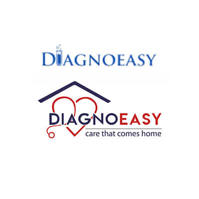
The brand name and logo were all addressing the service of a DtoD Diagnostic entity. Neither the name nor the logo defined the evolved brand salience or the brand proposition. The existing colours were not too akin to the category either.
The name DiagnoEasy was a registered name and already attracted investments. The name wasn’t east to pronounce too; especially for the elderly people.
Required a solution – To create an identity that will conspicuously establish the brand proposition and will also have a solution to the pronunciation of the brand name.
Just adding a tagline to establish the brand proposition wasn’t a solution since the name and the tag line were contradicting.
This evolution needed to be reflected in the company presented themselves.
Our solution –
- Breakdown the name into two parts with colour differentiation.
- Create a mnemonic that will overpower the name and communicate home healthcare.
- Add a tag line that will communicate the brand proposition in sync with the newly created identity
- Balance the font strengths of the brand name and tagline so that Diagno is underplayed.
A home on top: because healing starts where you belong.
A heart with a stethoscope: because care isn’t a transaction, it’s a bond.
A bold unmistakable font: because healthcare should be strong, transparent, and built on trust.
And the new tag line Care That Comes Home perfectly captures the evolved product proposition.
With the lew logo, the company aligns with the caregiver brand archetype and positions Diagnoeasy as a brand that people don't just rely on, but also feel safe with.